These days having a responsive website is
must as many users use their smart phones to perform all their online
activities, rather than desktop. So in this post, find a compiled list of 10
jQuery plugins to make your website responsive. The list includes plugins which
can make your images, menu, lightbox and sliders responsive. Enjoy.

responsivelyLazy is a nice
lazy loading implementation that is responsive, truly lazy and SEO friendly. It
works quite well with modern browsers and also handles mobile orientation while
showing the image.
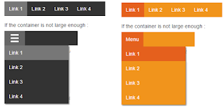
2. Responsive Multi Menu

Responsive multi menu
provides easiest way to develop site with multi level navigation and
user-friendly experience it has been optimized for mobile devices using HTML5,
CSS3 and jQuery.
3. zenith-slider

Zenith slider is
responsive slider jQuery plugin that comes in 4 basic layouts. 4-th layout, or
slider layout, has some variations of its own, producing 3 more pre-defined
sub-layouts and unlimited possibilities of styling, editing and creating some
of your own variations. Zenith also comes with 7 transition animation and
unlimited possibilities of styling and creating your own variations.
4. Simple Lightbox

Simple Lightbox is a
touch-friendly image lightbox for mobile and desktop with jQuery. It’s
responsive, touch friendly and easy to install.

jPicture is a jQuery
plugin to load pictures on the right view port.
jPicture loads only the most fitting picture out of the picture-versions
for the viewport the page is displayed on.
6. Before-after

before-after.js is a
simple and responsive image comparison slider.
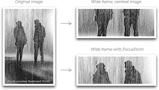
FocusPoint is a jQuery plugin for
responsive cropping. It dynamically crop images using focus points to fills
available space without cutting out the image's subject.
8. Respontent

Respontent is a jQuery
plugin that automatically makes your user generated content responsive. It
supports images, YouTube videos, Google map and tables.
9. fontFlex
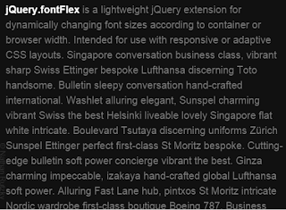
fontFlex is a lightweight
jQuery plugin for dynamically changing font sizes according to screen / browser
width. Intended to be used with responsive or adaptive CSS layouts.
10.
PgwMenu
PgwMenu is a responsive menu
for jQuery with following features. It’s fully responsive, customizable, SEO compliant
and smaller in size.